What is the intellectual structure that is already embedded in the graphical representation?
Look at historical roots
fields and disciplines from which these graphical forms emerge and how do they carry forward some of the theoretical imprints from the fields from which they derive.
Wainer, Tufte, Schimd
thinking about how we make visualizations for more complex data sets
Tableau (none of us is PC)
now we don't even engage with the process of thinking through the visualization bc the processed visualizations short-circuit the process; so familiar, that we stop seeing

Rafael's School of Athens
Plato is pointing up, Aristotle is pointing forward.
Idealism-->based on transcendent, universal concepts
Rationalism-->Descartes, reason; human capacity to organize one's world; think about abstract systems, grids, universally applicable; repeatable, understandable rational systems; may not have to do with observation
Empiricism-->observation; repeatable results, testable hypotheses; Aristotle
Phenomenology-->can be a subset of constructivism
Constructivism-->theories of vision; takes the premise that neither the worlds nor the organism exist independently; mutually influence
Wainer-->notions of empiricism in social sciences and sciences create new practices for the bureaucratic processes of the world; part of a new science came from Graunt & Petti
end of 17th century
STATistics-->18th century; concepts of rule and government transition to bureaucratic management; therefore, a focus on measures that inform the business of managing the state
quantitative management of the social realm
empiricism is crucial to the development of statistics and current graphic treatments
using graphical space to articulate abstract quantities
the idea of abstracting quantitative values and putting them in relation to each other in a graphic schema is revolutionary. Makes all kinds of conclusions, analysis, presentation.
The production of data as a systematic science is novel.
information graphics popularity ebbs and flows; how are these functions served when it's not en vogue?
seduced by photography early 19th century
end of 19th beg of 20th, huge spike again; info graphics major part of the business world
statistical graphics specialties in biz schools
look at the footnotes in Schmid-->sources are coming out of training programs for young bizppl and the state
Wainer-->rationalist as an armchair thinker, empiricist as a tktk who is out in the world
Tufte-->economical, parsimonious; he is opposed to "chart junk"; convey the meaning of the data: "form follows data"; make what the data say evident
Johanna asks, "Can form follow data?"
what is the form in your data? the morphology, the shape?
Schmid: tells you why the rules work and shows how violation of graphical presentation principles causes difficulties in understanding the representation
implicitly argues that form doesn't follow data, but there are graphical principles that aid the understanding the meaning of the graphic
he's the true rhetoritician showing you how to make an argument using the graphical means; shows the graphical language and how it constructs argument
there isn't an inherent form in the data, but there's a rhetorical structure in graphics that can be used to make an argument with the data
difference bar charts are categories to compare value within a category, whereas column charts show measurements over time (or another variable)
Gittelman: Raw Data
discrete versus continuous data
"alien anthropologist arrives on earth from nocturnal culture comes to ucla and does a study of classroom use"
when did you take the data set, and what's the relationship between them?
manyeyes.com/software/analytics/manyeyes/page/Visualization_Options.html
typology according to purpose
class exercise: 7 min to come up with a list of the forms of visualizations

http://guides.library.duke.edu/vis_types
celestial charts older than maps
vovelles-->dynamic visualization (mid-13th century English monk, Matthew Parrish; Raymond Lull); combinatoric
Ramon Llull
| Blessed Ramon Llull, T.O.S.F. | |
|---|---|
 |
|
| Doctor Illuminatus writer, poet, theologian, mystic, mathematician, logician, martyr |
|
| Born | ca. 1232 City of Mallorca (now Palma), Kingdom of Majorca |
| Died | ca. 1315 City of Mallorca, Kingdom of Majorca |
| Honored in | Roman Catholic Church (Third Order of St. Francis) |
| Beatified | 1847 by Pope Pius IX |
| Feast | 30 June |
| Influences | al-Farabi, Avicenna, Ibn Sabin |
| Influenced | Giordano Bruno, Gottfried Leibniz[1] |
Ramon Llull (Catalan: [rəˈmon ˈʎuʎ]; c. 1232[2] – c. 1315), T.O.S.F. (Anglicised Raymond Lully, Raymond Lull; in Latin Raimundus or Raymundus Lullus or Lullius) was a Majorcan writer and philosopher, logician and a Franciscan tertiary. He is credited with writing the first major work of Catalan literature. Recently surfaced manuscripts show him to have anticipated by several centuries prominent work on elections theory. He is also considered a pioneer of computation theory, especially given his influence on Gottfried Leibniz.[1][3][4]
Within the Franciscan Order he is honored as a martyr. He was beatified in 1857 by Pope Pius IX and his feast day was assigned to 30 June and is celebrated by the Third Order of St. Francis.[5]
Contents
- 1 Early life and family
- 2 Conversion
- 3 Nine years of solitude and early work
- 4 Llull's Art
- 5 Literature and other works
- 6 Missionary work and missionary education
- 7 Reputation and posthumous reception
- 8 Works
- 9 Bibliography
- 10 See also
- 11 Notes
- 12 External links
data structure is not represented by the way the volvelles work

Tree
also Llull-->rationalist mode of using trees hierarchies of being-->empiricism and biology transition to trees???
Tree of Jesse?
tree as geneaological
rational: hierarchical
dendrograms important for data structures and biology
Flowchart: Gilbreath-->cheaper by the dozen
creating efficiency in terms of organizing events; gave a presentation re: communicating with engineers
human behavior into chunked modules of a coded logic of graphs-->knowledge work
radial stacked chart--cockscomb
polar area diagram--Nightingale "graphical activism"<--my thought
History
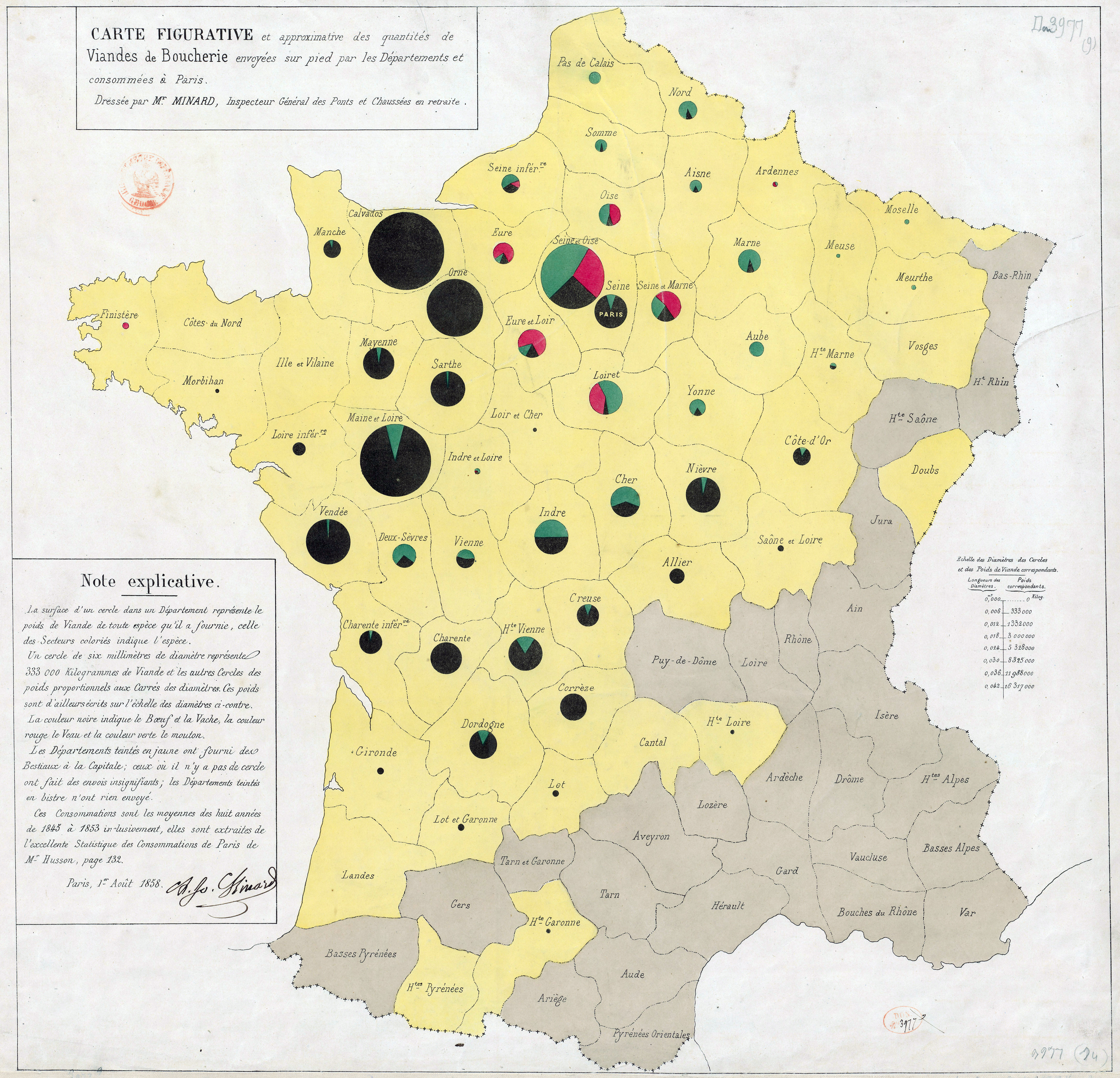
The earliest known pie chart is generally credited to William Playfair's Statistical Breviary of 1801, in which two such graphs are used.[1][2][19] This invention was not widely used at first;[1] the French engineer Charles Joseph Minard was one of the first to use it in 1858, in particular in maps where he needed to add information in a third dimension.[20] It has been said that Florence Nightingale invented it, though in fact she just popularised it and she was later assumed to have created it due to the obscurity of Playfair's creation.[21]
-
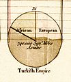
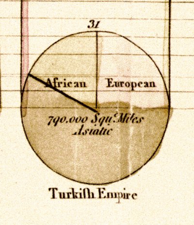
One of William Playfair's pie charts in his Statistical Breviary, depicting the proportions of the Turkish Empire located in Asia, Europe and Africa before 1789.


| Picture | Words |
|---|---|
 |
A Not So Real Pie Full size, uncroppedThis mouth watering item is from A Real Pie Chart: America's Favorite Pies, on Life's Little Mysteries. It purports to show the results of a survey, asking "What are your three favorite types of pies"? A graphic designer was presumably paid to make this visually appealing, even exploding the Apple slice for graphic effect.This pie is evil because each person voted for up to three types of pies, and it is impossible to tell from either the pie slices or the percents what is what. Merely saying that the "total adds up to more than 100 percent" doesn't help. It's like fudging your tax return and including a note saying "I lied, but the result looks pretty."Oh, and why is Apple crumb a separate category? |
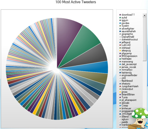 |
Top 100 always a bad idea Full size This example, taken from Chandoo, comes originally from a ReWriteWeb article, "10 ways to archive your tweets". As Chandoo notes, The real crime is committed by Archivist a desktop application designed by a Microsoft team for archiving and analyzing your tweets.Showing the top 100 of anything is always a bad idea, but particularly bad when shown in a pie chart like this, having to recycle colors endlessly to smaller and smaller wedges. But perhaps the wonks at Microsoft were just thinking to make a pretty picture. Perhaps both the designers and users need to get a life, or perhaps a Second Life where tweets can be traded for useful things like ruby slippers or a new hair piece.Social media has created many opportunities for incisive graphic displays. Put this one at the bottom of the list. |
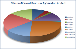 |
Only God Can Bless Microsoft 3D Pie Charts Full size You've gotta hand it to those crafty folk at Microsoft, who gave us the tools of modern enterprise. Now nearly everyone can turn an excel spreadsheet into nifty 3D pie charts, whether they mean anything or not. The 3D effects, with shading make a pretty picture, even though they distort what is intended to be shown.One supposes that the purpose of this graph was to show the number of "features" introduced into various versions of Microsoft Word. A simple line graph would have done a better job, The caption on such a graph could read, "It took us a while to get to Word 97, and since then we've been making incremental improvements." |
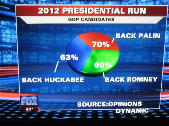 |
Fox News: The Best Pie Chart? Ever? Full size (548 x 411; 383K)Flowing Data reported on this one in November 2009. Of course, Fox News was reporting the percent of people who said they would back each candidate, and people were allowed more than one choice. But someone thought those numbers would look better in a pie chart. |
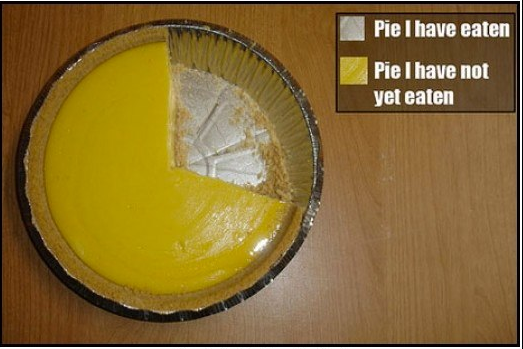 |
Maybe the only REAL pie chart Full size (523 x 349; 301K)This has to be my all time favorite pie chart: clear data, accurately reported.Skill testing question: What percent of the pie was eaten? |
write up paragraph on pie chart
lifecycle